
Platform:
iOS, Android
Role / Team:
Lead designer (interactive, visual & prototyping) / Project manager, research, content, product developer, front & back end engineers, and accessibility.
Define
Challenge
New and current users expressed how the initial eBay onboarding experience (below) felt primarily outdated. They also wanted to know at a glance the benefits of creating an account.
Goals
Modernize
Update the visual language with clear user social account integration from the beginning.
Ease of Use
Create an easy and fast way for users to start the onboarding process and drive conversion.
Entice
Hint users with benefits for creating a new eBay account or logging in.
User Profile
New and current users that downloaded the eBay app from the App Store, Google Play, or clicked the “Download the App” banner on eBay’s website.

New User
This is a new eBay user or prospect with a high probability of creating an account motivated by the app download.
Design
Typography
Described as “a typeface that captures the surprise of stumbling upon your perfect purchase”, Market Sans was specifically designed for eBay and used for titles and subheaders.


System Elements
In collaboration with the eBay systems team, I was able to add new iconography, module updates, and condensed social buttons to the eBay system library.

Concepts
The initial suggestion from the PM was to create a multi-screen onboarding experience, but while exploring that option I began to look for other concepts that simplified more the original user experience.

Journey Map
As we can see below the user journey is shorter and simpler than having a multi-screen intro, with a way to still bring up the onboarding module even if the user dismisses the initial screen.

Structure
Even though the iterations below could work as standalone versions, we saw that they could be potentially combined for particular use cases.


Deliver
Final Designs
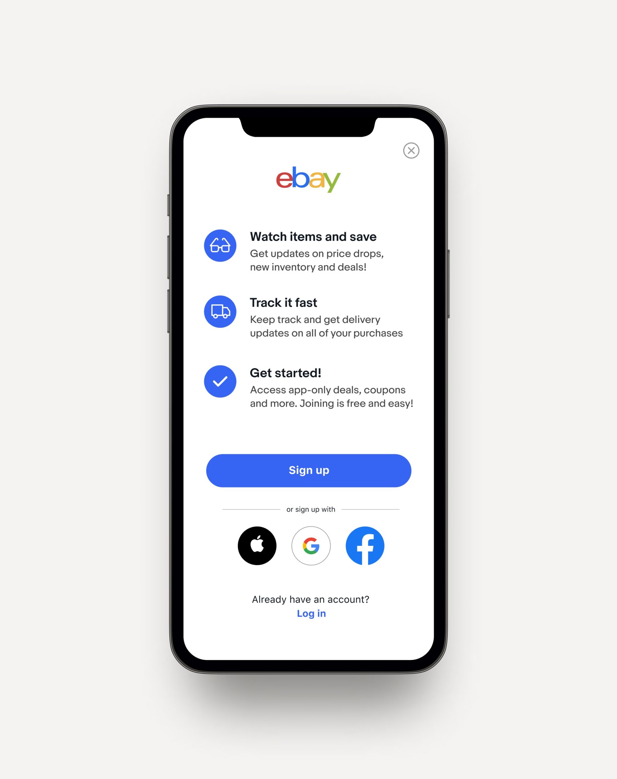
We decided to go with a combination of the single screen and mini-sign-up module options as users liked to have the featured benefits displayed at a glance and not swipe left to see each one. If the users were to dismiss the screen, they would then land on the browsable HP with the same options.


Bottom Sheet Modal
There was an additional entry point where the mini sign-up module fit perfectly and was basically a bottom sheet modal that solved the use case when a user wanted to like an item or add it to a watchlist and they were not signed up or in.

